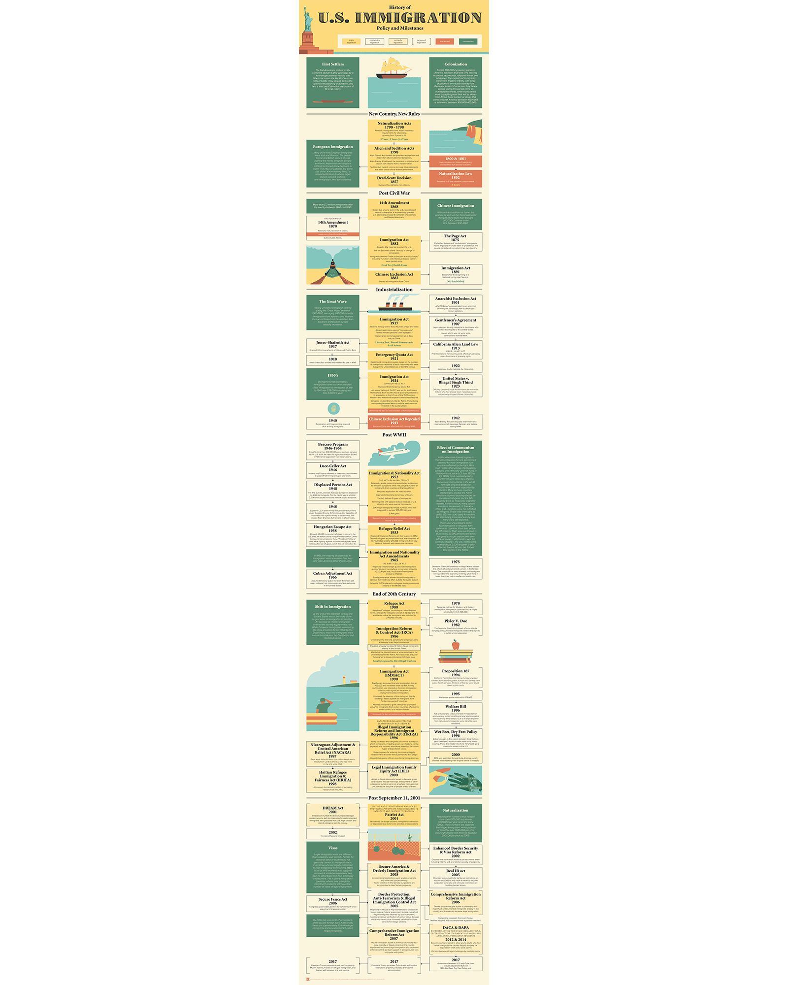
An infographic showing the timeline of immigration that gives a sense for the number of people who came to the U.S. in different periods, where they were coming from, in some cases why they were coming, and the U.S. response to the influx. Available as a secure PDF that you can print yourself.
No results match your search. Try removing a few filters.